
How to use these images
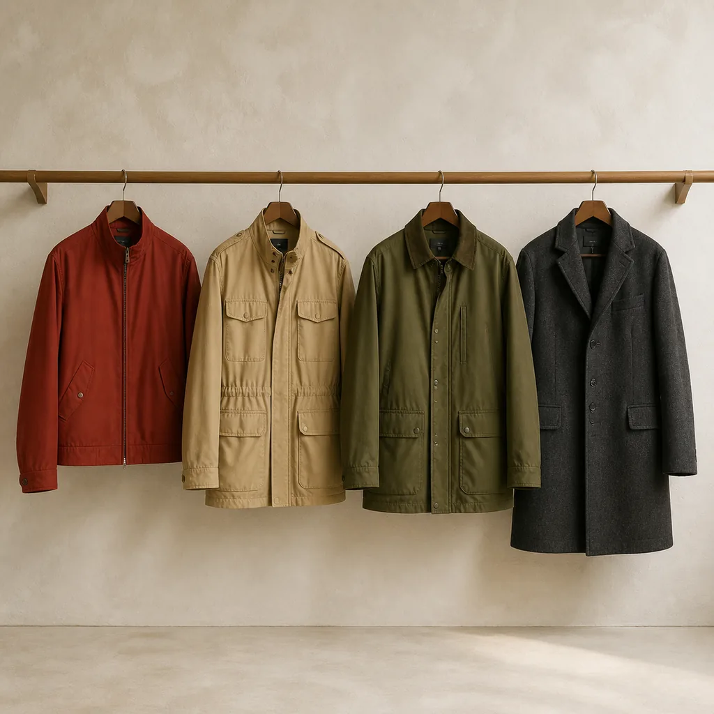
This essay began as a page of visual reminders. Seeing the same person in different outerwear colors let me quickly recall how each color changed the whole outfit and whether it connected with clothes I already owned. Once the old draft retained only a cover showing garments on a rail, its most useful function disappeared. This rewrite restores that function first, then adds a test that can constrain actual purchases.
All five body-image figures were generated with OpenAI image_gen. The model is a fictional person and does not represent the author; the garments do not correspond to products for sale. The generation process locks the person, pose, camera, backdrop, and lighting as closely as possible, although small AI inconsistencies may remain. The figures support relative comparisons within this series and do not replace a physical try-on.
| Figure set | Conditions held constant | Conditions changed deliberately | Question it can answer |
|---|---|---|---|
| Four-color control | Model, pose, camera, lighting, top, trousers, shoes, and jacket design | Outerwear color only | How do four colors reorganize the same outfit? |
| Two looks for each color | Model, camera, lighting, and that section’s outerwear color and design | Top, lower garment, and shoes where needed | How can one outerwear piece enter two common palette directions? |
The International Commission on Illumination’s CIECAM16 color-appearance model accounts for viewing conditions and chromatic adaptation. The studio light, display, fabric texture, and your physical surroundings all differ, so these colors are only memory anchors. The generation prompts used sRGB targets of brick red #984737, warm beige #C2A77D, olive #66683D, and charcoal #3C4043; these codes document this image series rather than define retail colors.
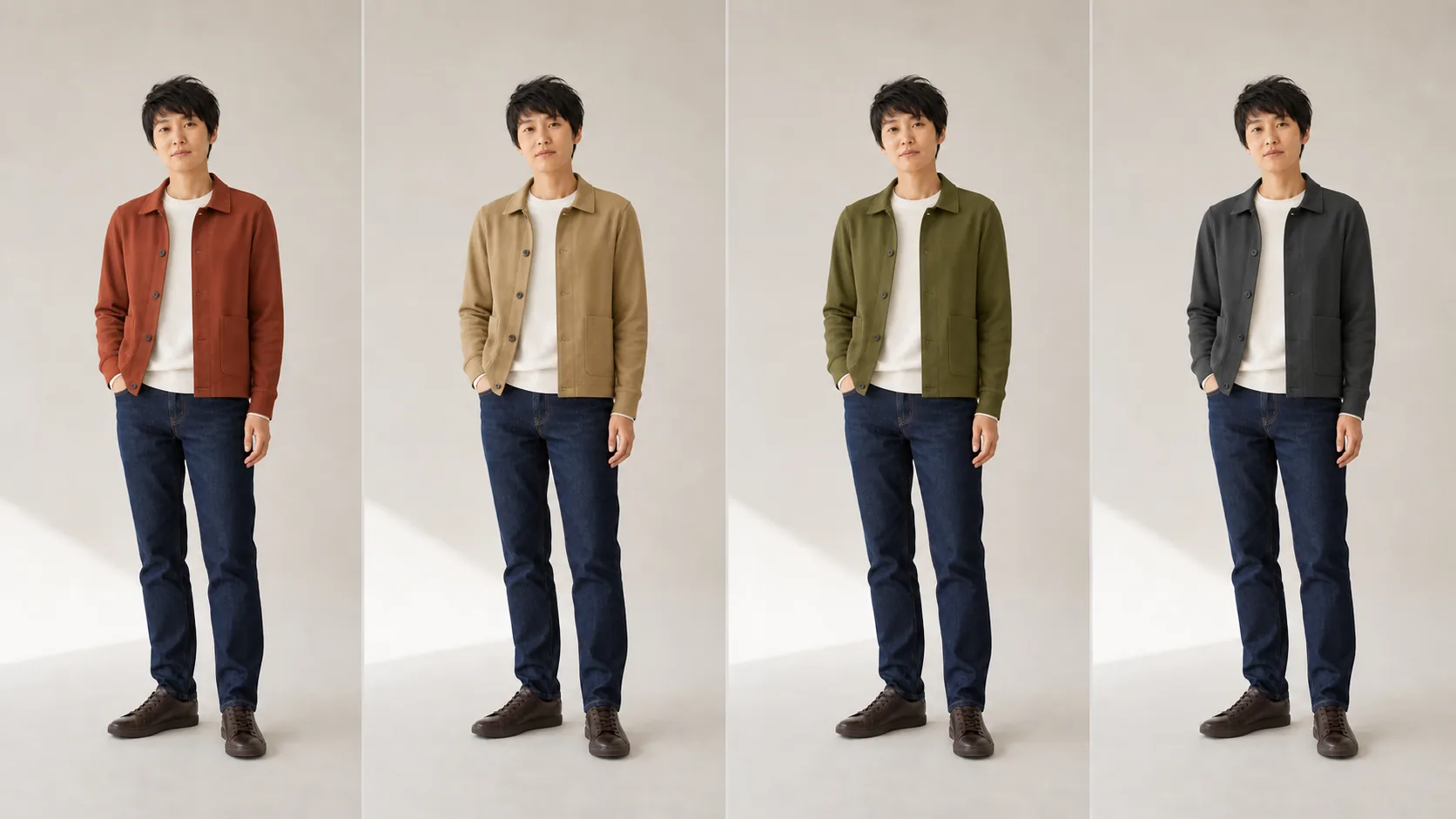
Figure 1 — Controlled four-color comparison. The model, top, lower garment, shoes, jacket design, composition, and lighting stay fixed across all four panels; only outerwear color changes. AI-generated illustration, not a physical color sample.
Give each color one visual task first
These four colors come from gaps in my wardrobe. They are not a universal list of essentials. I assign each one a distinct task before judging a specific garment, which helps prevent several neighboring retail color names from masquerading as several real needs.
| Color | Main task in this series | Existing clothes that provide an easy start | Failure signal to watch |
|---|---|---|---|
| Brick red | Add a warm focal point to a muted outfit | Warm white, charcoal, navy, denim blue, beige | The top, shoes, and accessories are also conspicuous, so several focal points compete |
| Warm beige | Raise overall lightness and bridge pale and natural colors | Pale blue, white, charcoal, denim blue, olive | Similarity to skin or backdrop is not automatically a failure; fabric, silhouette, and cleanliness become more exposed |
| Olive | Provide a low-saturation bridge between neutrals and obvious color | Warm white, denim blue, charcoal, brown, muted red | Army, moss, and gray-green labels describe outerwear pieces with the same actual use |
| Charcoal | Provide a dark frame that lets the underlayer set formality and color direction | Pale blue, warm white, navy, olive, muted warm colors | Length, temperature range, and occasion add nothing beyond an existing black or dark-gray piece |
Four short cues are enough to begin: brick red supplies focus, warm beige raises lightness, olive connects, and charcoal contains. The paired figures below show how those tasks enter specific outfits.
Brick red: quiet the other large color blocks
Under the fixed conditions in Figure 1, brick red is the most conspicuous colored block on the upper body. That observation belongs to this series: it shows that brick red can carry focus, not that everyone must prefer the effect.
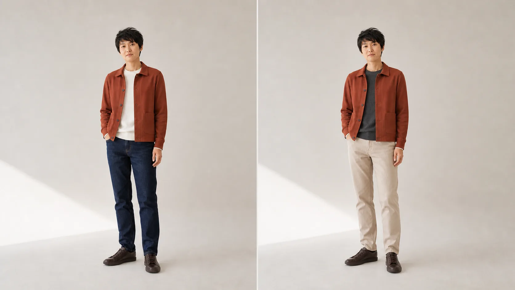
Figure 2 — Two entries for brick red. Warm white and dark indigo make clear light-and-dark zones on the left; charcoal lowers the top’s emphasis on the right, while warm-beige trousers carry the jacket’s warmth downward. The model, outerwear, camera, and lighting stay fixed. AI-generated illustration.
The left side is closest to my easiest reusable outfit: warm white gives brick red a clean edge, while dark-indigo jeans keep the lower body stable. The colors on the right stay within a warmer range. The charcoal top still leaves the jacket as the main focus, and warm-beige trousers soften the abrupt division that a black lower half could create.
If a brick-red outerwear piece depends on new trousers, one exact pair of shoes, or a complete special look, it has not improved the current wardrobe. Before buying, I test it with my most-worn dark lower garment, my hardest pale lower garment, and two high-frequency pairs of shoes. If only one outfit succeeds, I treat it as occasion clothing rather than everyday outerwear.
Warm beige: redraw the boundaries with the layers below
Warm beige does more than qualify as “versatile.” It raises upper-body lightness while making fabric texture, collars, pockets, and marks easier to see. The same beige on crisp cotton, suede, or wool can imply different seasons and levels of formality.
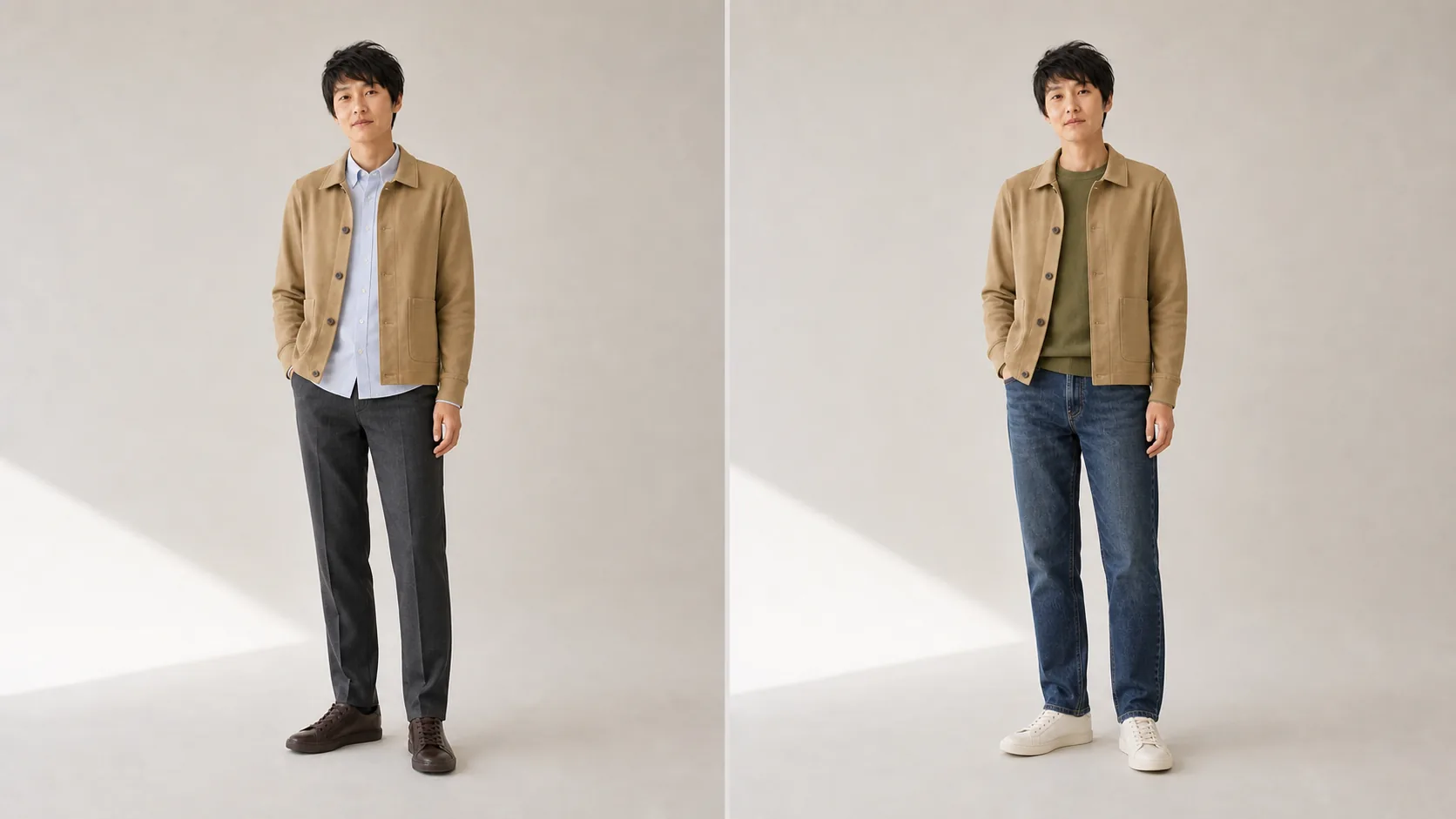
Figure 3 — Two boundaries for warm beige. A pale-blue shirt adds slight hue separation on the left and charcoal trousers anchor the lower half; olive and mid-blue denim stay within a muted range on the right, while off-white shoes continue the pale tones. AI-generated illustration.
The left suits days that need a somewhat tidier outline: jacket, shirt, and trousers remain legible as layers without relying on a strong clash. The right is more casual. The olive top adds color rather than disappearing into a colorless backdrop, and mid-blue denim is gentler than a black lower half.
A warm-beige candidate needs both a color test and a maintenance test. In daylight, I check whether it leans yellow, gray, or pink, then inspect how readily the collar, cuffs, and pocket edges show marks. If the wardrobe already contains khaki or pale-brown outerwear, the candidate should add a real difference in length, material, temperature range, or formality.
Olive: lower saturation and connect cool and warm sides
Retail pages divide neighboring olives into army, moss, khaki green, forest, or gray-green. Names do not establish distinct wardrobe uses. Lightness, yellow or blue bias, fabric sheen, silhouette, and the relationship to existing clothes matter more.
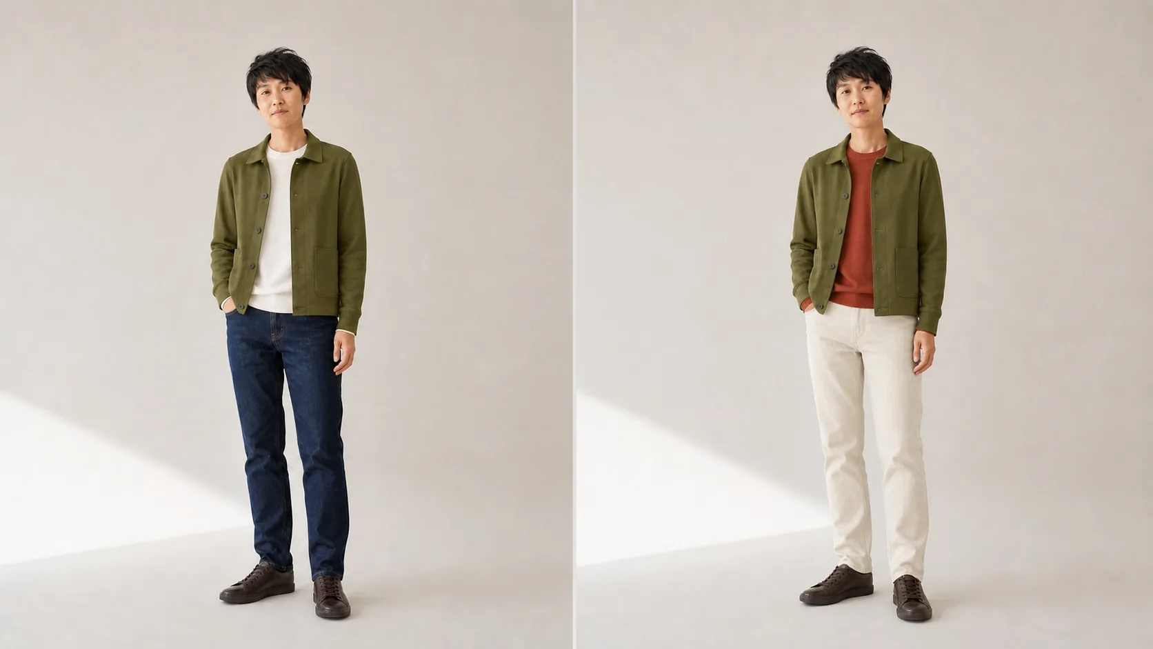
Figure 4 — Two directions for olive. Warm white and dark indigo form a quiet base on the left; muted brick red and olive introduce two colored layers on the right, while ecru trousers separate them. AI-generated illustration.
The left is a low-risk combination for testing whether an olive outerwear piece can enter an existing denim wardrobe. The right retains two colored layers, but both are muted and the ecru lower half gives them room. A brighter red, more vivid green, or shinier real fabric would change that balance.
Olive carries work jackets, field jackets, and short parkas with some structure well, provided that pockets, drawcords, epaulettes, and hardware do not all create additional focal points. When a neighboring green already exists, I put both pieces into the same high-frequency outfits. A candidate that adds no wearable combination merely replaces one color name with another.
Charcoal: let silhouette and underlayers set formality
Figure 1 uses the same short jacket to isolate color. The next figure switches to a longer wool coat because that is the real use charcoal serves in my wardrobe. The figures answer different questions: the first compares color; the second compares how one long coat enters two settings.
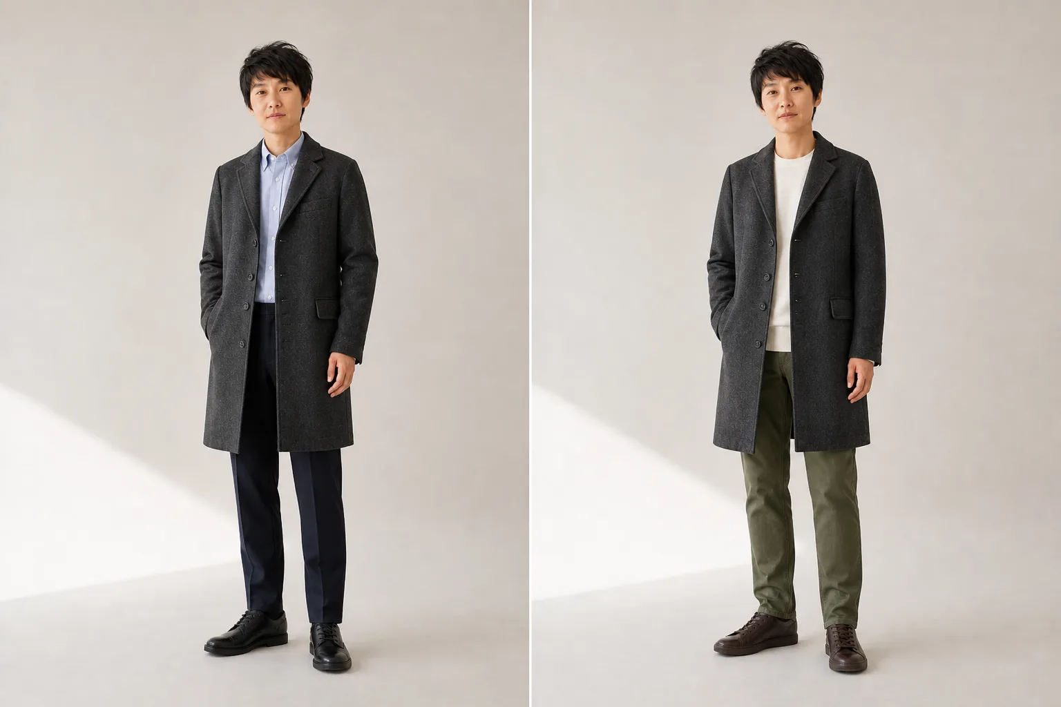
Figure 5 — Two levels of formality for a charcoal coat. Pale blue, deep navy, and black shoes produce a clearer commuting line on the left; warm white, olive, and brown boots relax it on the right. The model, coat, camera, and lighting stay fixed. AI-generated illustration.
Charcoal retains more wool texture than pure black under soft light, while allowing pale blue, warm white, olive, or a muted warm color to set the direction. Dark trousers continue the coat’s vertical outline on the left; olive trousers bring the dark coat back toward everyday wear on the right.
I inspect dark outerwear in daylight to see whether it leans blue, brown, or nearly black, then place it next to the black trousers, navy trousers, and shoes I actually wear. Uniform exposure on a retail page compresses differences among dark colors. If a black long coat already exists, a charcoal one must solve another problem in warmth, weight, movement, or formality.
Why this is not a universal color rulebook
Schloss and Palmer’s controlled color-patch experiments distinguish three judgments: liking a pair as a whole, finding the pair harmonious, and preferring a foreground color against its background. Hue similarity, component preference, and lightness contrast affect those judgments differently. Collapsing “harmonious,” “liked,” and “conspicuous” into one conclusion removes the boundary a useful outfit guide needs.
Fashion research does not supply a permanently valid color wheel either. Zhang and colleagues’ study of color compatibility in fashion outfits notes that hand-built hue templates can diverge from user data and that a whole outfit cannot reliably be reduced to several pairwise matches. Fashion datasets still contain platform, period, and trend biases. This essay therefore uses a smaller, testable conclusion: let the figures produce candidates, then let your existing clothes, occasions, and use records decide which survive.
Test an outerwear piece by new wearable outfits
Hsiao and Grauman’s capsule-wardrobe research separates compatibility, coverage, and personal preference, and emphasizes that adding one garment creates several possible outfits at once. The practical idea I borrow is to count new wearable outfits, not the “goes with everything” imagined on a retail page.
I first lock a small sample from real life: two high-frequency tops, one difficult top, three frequently worn lower garments, and two high-frequency pairs of shoes. They permit at most eighteen theoretical combinations, but I count a combination only when it meets every condition below:
- It works without buying another top, lower garment, pair of shoes, or accessory.
- Sitting, reaching, walking, carrying a bag, and adding a normal layer remain comfortable.
- It matches weather and an occasion that will actually occur within the next month.
- I would leave home in it, rather than merely admit that the photograph has no obvious problem.
- Existing outerwear cannot provide the same result, or the candidate explicitly replaces one current piece.
The following table is enough for a record. A failure reason is more useful than a total score:
| Actual combination | Occasion and weather | Comfort and movement | No extra purchase | Can current outerwear replace it? | New outfit? |
|---|---|---|---|---|---|
| Top A + lower garment A + shoes A | Example: ordinary commute, 12–18°C | Pass / reason for failure | Yes / No | Can / Cannot | Yes / No |
| Top B + lower garment B + shoes A | |||||
| Top C + lower garment C + shoes B |
My personal stopping rule is at least three ready-to-wear combinations that require no extra purchase, cover two real occasions, and include at least one combination that existing outerwear cannot provide. The number is not a research finding. Its value comes from writing the threshold before browsing, so an attractive item cannot quietly lower it later.
Replace the generated figures with a personal memory card
Generated images are useful for finding directions; your own body and clothes should make the final decision. After a try-on, a phone can produce a more reliable personal memory card:
- Use the same wall, window, and similar time of day; disable filters and lock exposure and white balance when the phone permits.
- Keep camera height, stance, distance, and full-body crop constant, changing only one declared set of variables at a time.
- For each candidate outerwear piece, photograph the most-worn, hardest-to-pair, somewhat formal, and weather-specific combinations; skip occasions that do not apply.
- Outside the image, record the top, lower garment, shoes, temperature, occasion, and reason for failure instead of relying on vague “good / bad” labels.
- After four weeks of wear, remove combinations never used in real life. The remaining photographs are the atlas worth reopening before the next purchase.
That personal card should gradually replace the AI figures in this article. It preserves the same comparison discipline while adding your body, movement, daily settings, and actual clothes.
Complete a physical check before buying
Clothing-durability research by WRAP and the Leeds Institute of Textiles and Colour found that price, brand, and fiber composition do not predict durability on their own; durability has to be measured. A personal try-on cannot reproduce laboratory tests, but it can reject candidates that are plainly unsuited to frequent use.
- Color: inspect it in daylight, usual indoor light, and shade, placed next to the trousers and shoes you wear.
- Silhouette: check shoulder line, sleeve length, hem, and layering capacity, and confirm a real difference from existing outerwear.
- Movement: sit, reach, walk, carry a bag, and fasten the garment while checking comfort.
- Construction: inspect zips, buttons, seams, pockets, lining, and high-friction areas, treating this only as a screen for obvious problems.
- Care: verify the care label and whether lint, pilling, marks, rain, drying, and storage demands match expected use.
- Combinations: reach the new-wearable-outfit threshold written in advance.
- Replacement: if the use overlaps, name the item to be replaced and decide its fate only after the trial period.
These four colors remain only my starting point. The method is what this essay needs to preserve: hold conditions constant to see differences, count new combinations in the actual wardrobe, and let daylight, movement, maintenance, and real wear records overturn imagined success. An outerwear piece that survives those checks has a better chance of becoming something worn often rather than an attractive isolated purchase.
Comments
Comments are public and stored in GitHub Discussions. This page connects to giscus.app and GitHub and sends the current page path only after you show comments manually or enable automatic loading. The first load is about 0.13 MB; actual usage varies with comment content. Do not include private information.